What customization of editing tools is available? For example, pick your colors and fonts or locked in choices.
Notes below about CheckThis, Marquee, Medium, Smore, and Tackk.
CheckThis
 Customization is quite limited in CheckThis posters. Individual elements can’t be customized, only the overall look of the poster can be changed. By clicking on the “Aa” icon while in edit mode you can choose from five looks for your poster (book, modern, classic, artsy, and simple) and pick a color palette (or control the title, text, block, and page colors individually).
By clicking on a bright green plus sign you can add blocks to your poster. These can be text (title, header, text), image, video, more (map, sound, tweet, weblink), or apps (payment, poll) blocks with text, more, and apps all popping up menus of choices that could easily be expanded in the future.
While hovering over a block a gear icon appears in its top right corner which expands to allow you to link the whole block to an external website, delete the block, or move the block in relation to other blocks.
Marquee
Editing in Marquee is fairly modal. While it does not pop up a literal “dialog box” it does essentially the same thing, not editing text in place and requiring a confirmation click on a “save” button for each element. However, while you are editing in the modal sense, the actual text of the page is changing in the background, giving you a sense of the outcome before you click “save.”
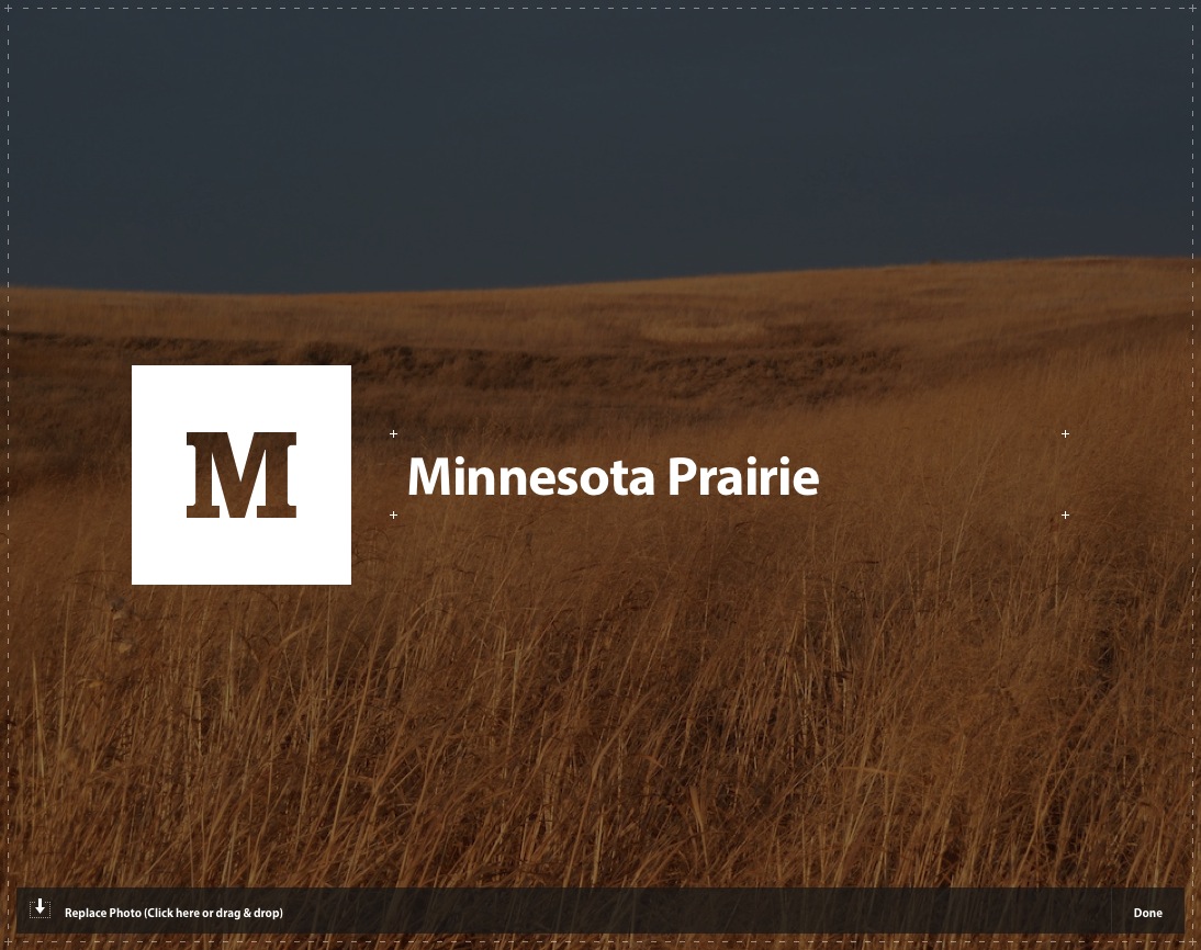
 While there are very limited style choices for individual elements, there are fairly open choices for the style of the page overall. The user can specify the color of the title text and the background of the title area, fonts (font, color, size) for heading, body, and quotes, a background image for the main page content area, and an accent color. Choices are reflected in page content immediately after they are made.
These choices are called a “theme” and can be saved in a theme “piggy bank” and reused on other Marquee pages.
Any changes made to Marquee pages are persistent, there is no “save changes” button or functionality. However, changes are not made public until the “publish” or “publish changes” buttons are clicked. All pages you have started, even if they have not been published, are available to you from your profile page.
Medium
 Not much to see here. However, the clever way the pencil icon is used on the front page offers a hint. Clean graphics, hover description, more modal guidance available but not required to edit. A very clean approach.
Smore
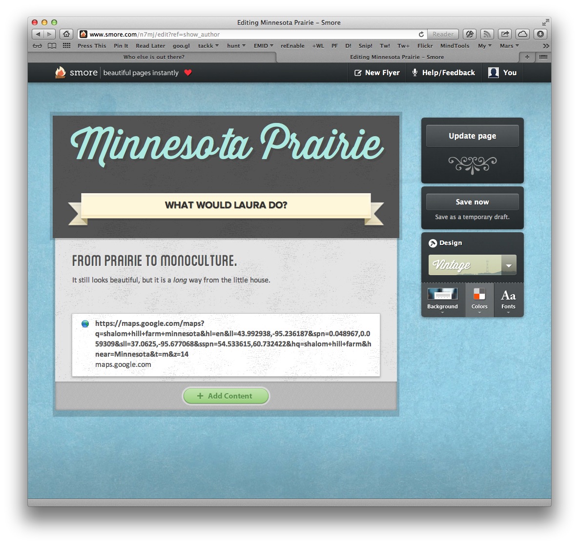
 There is very little control of the look and feel of Smore flyers. You can choose from four designs: handwritten, minimal, modern, or vintage. Each of these will then offer a very limited set of choices for background, color, and font.
For example the vintage design offers a choice of 16 background images, 11 color palettes, and 4 fonts.
Tackk
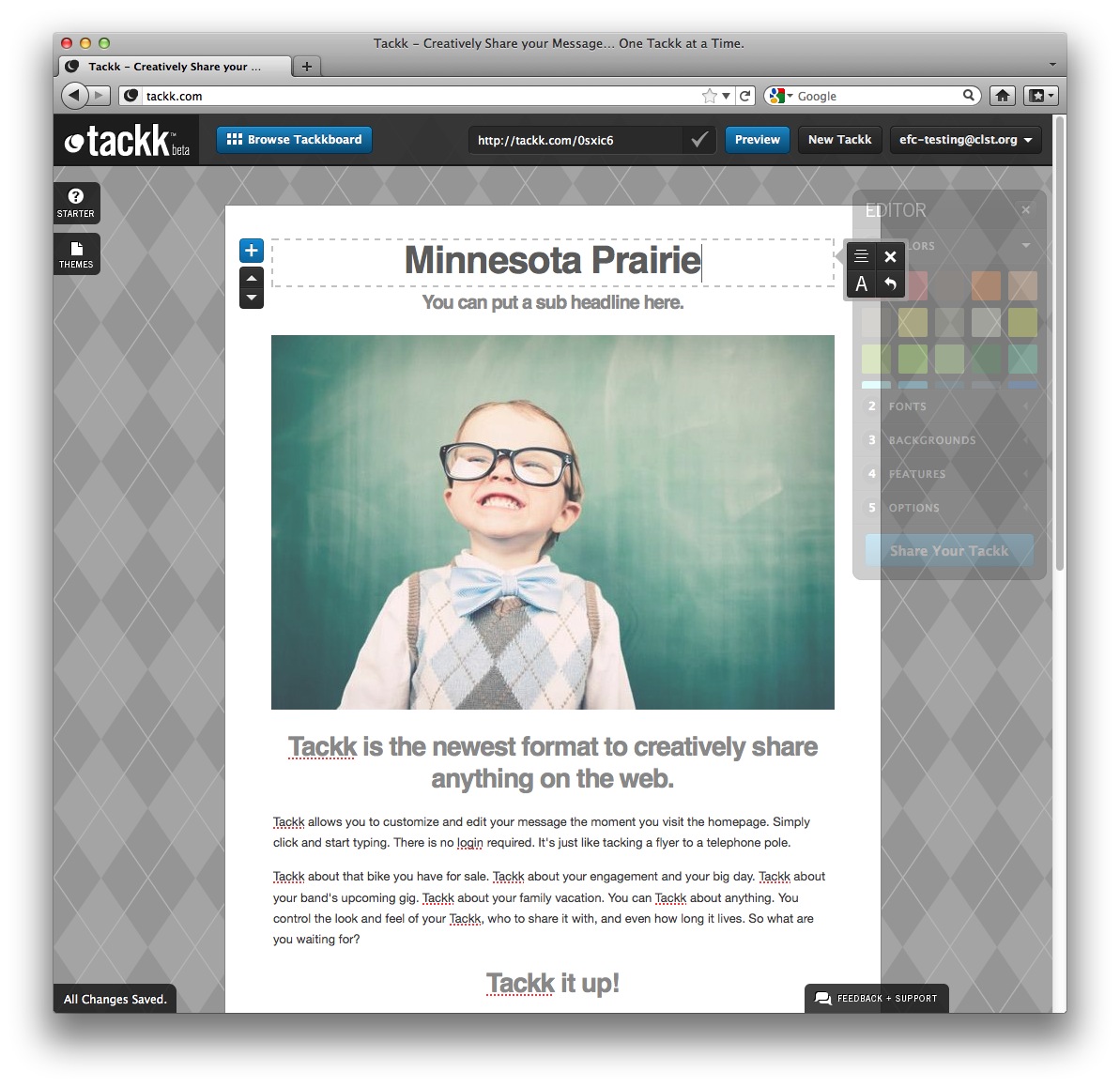
 Editing text is direct, not at all modal. Click on the text to be edited and type away. While entering new text some style icons appear to facilitate certain changes (justificaiton, size, undo, and so on).
Some tasks are more modal, such as uploading a photograph which requires not only a selection of the photo, but a confirmation of the process with a click on an “Upload Now” button.
The background can only be chosen from a limited set of textures, there is no way to use one’s own photo as a background, for example.
Even though the “editor” floating window (and it really does float, I can move it!) seems like something that could change the attributes of any element, it becomes apparent that it only effects global settings for the whole tackk. For example, the “colors” can’t be used to change the color of an individual headline, but only all the headlines and the background. This is more similar to what Marquee calls the “accent color,” though less explicit about that role.
Each setting in the “editor” window also has a prominent number (“colors” is “1” for example). These numbers don’t seem to serve any function (they are not keyboard shortcuts, for example) and they imply a staging or order that is not, in fact, required.
When the editor window is dismissed (using it’s “X”) it retreats to a tab on the left side of the window. This tab, which expands to a floating window, behaves differently from the tabs on the right (which only expand in place, as though pulling their content from the right edge of the window) and the bottom (which brings up a modal window, or, in the case of the “All Changes Saved” tab, does nothing). This variety of behavior is a bit jarring.
Comments
You are welcome to edit this page if you have the password. You can also choose to just leave a comment below, if you like.
Roman / 06 December 2012 / 14:07
Hi Orman, I love your site and all your freebies look ftiaastnc, the problem I have is getting them from the psd and onto a webpage, could your please do a quick tutorial on the best way to get your designs from image file to the web. I know the basics of slicing but your designs seem to incorperate so many effects and layers its difficult to get it looking right.
fvuuaflbv / 07 December 2012 / 22:51
QLTrW6 wmqtgxsyhqwt
rcvewohgra / 09 December 2012 / 18:29
1n9pfo vjvnfqpwihcm