Describing themselves
Tackk is trying to invent a new word, “tackk,” through the careful emlimination of the words “page” and “web” from its site. The word can be both a noun (“finish your Tackk later”) or a verb (“Tackk it Up!”). They always capitalize it, except, oddly enough, in the logo itself.
The main pitch to be found is under the “starter” tab, and that pretty much refers to features (no login, no save, benefits of login).
From the about page: “No software or login is required. No design skill needed. No community to join. Just visit the Tackk home page and start typing. When you’re done creating your Tackk, you can immediately share it with friends in your social networks or the internet at large. It’s no more complicated than tacking a flier to the coffee shop bulletin board.”
Tackk refers to itself as “beta” in its logo.
Signing up
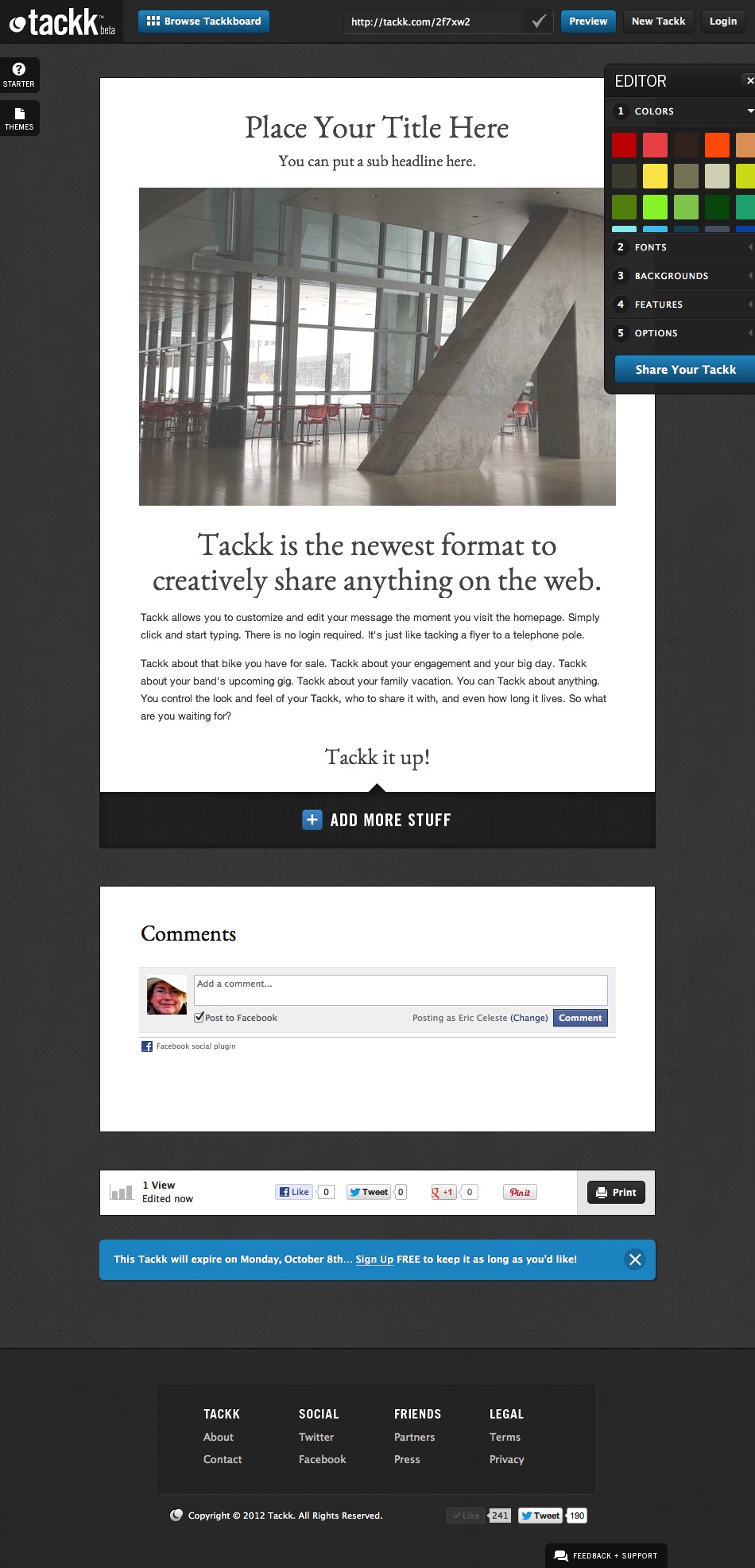 First approach to Tackk lands the user directly in the editing environment. There is a sense of depth to the environment, with tabs on two sides of the window, an editor with color swatches, and a top bar with a short URL. Depth, but also a bit of confusion, where to start? The eye is so attracted to the interface elements that it takes a few seconds to notice that the page itself, behind all that interface, is offering both guidance “Place Your Title Here” and a sales pitch “Tackk is the newest format to creatively share anything on the web.”
There is a “Login” button in the upper right, but it is unclear whether that is a demand or an offer (do I have to log in to continue?). Can I even log in without ever having registered? How can I register?
There is also a “New Tackk” button up there, similarly ambiguous. (Do I have to create a “New Tackk” or should I just edit this one?)
All in all, it is a bit confusing partly because of all the paths forward that are offered. Tackk ends up looking “technical.”
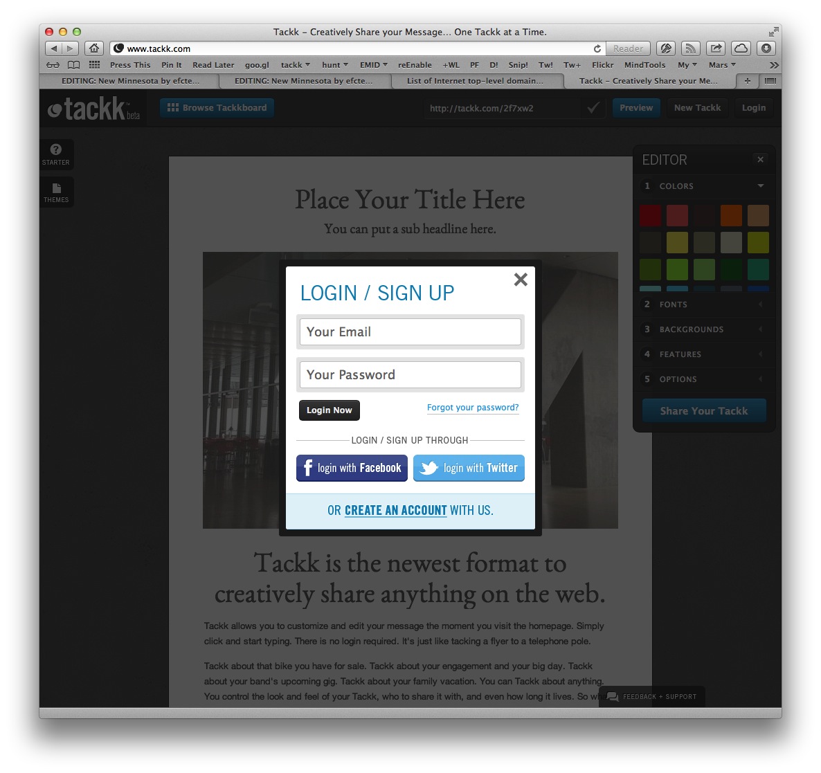 Clicking on the Login button produces a “login/sign up” popup. It might appear at first glance that creating an account is as simple as entering email and password, but that does not work. Instead, at the bottom of the popup is a lower-contrast “or create an account with us” option that leads to the real sign up option. Options for linking Tackk to Facebook or Twitter accounts are also available.
The actual “sign up with us” popup asks for email, password, and an agreement to terms of use and privacy (that nobody actually reads). Oddly, when I tried to use this to create an account I ran into an error (I had used too short a password) and then the system refused to create the account after I fixed the error. Clicking the “Sign Up” button did nothing. Reloading and retrying did not work. I had to switch browsers to Firefox, maybe because I’d used Safari in the past to log into a different Tackk account?
 After a successful login, you are taken to a profile page, of sorts, without personal information but with a list of your existing Tackks. For a new user, this list is empty except for a big “create new tackk” button. Clicking on this button brings you full circle, right back to what appears to be the homepage, with the editing environment, only now your email address instead of the “Login” button is in the corner.
Email contact
No welcome message was sent in response to the creation of the Tackk account. However, even if no Tackk is completed, a message does eventually get dispatched to the user encouraging further engagement and highlighting the Tackkboard.
Functionality & features
 The “starter” tab actually pulls up the sales pitch for Tackk. This is more of an “about Tackk” than an actual aid to starting anything, since the tackk is already present, editable, and started.
The “theme” tab presents a helpful list of templates for a new tackk. These templates are based on tasks: anything, events, housing, for sale, announce, and business. The term “theme,” which is used broadly on web services to refer to the “skinning” of content so that it looks different, implies that making a choice here would layer a new look over existing content. But this is not what happens. If content of the tackk has already been edited, then picking a “theme” provides an opportunity to start a new tackk with that template. The warning given in this case is especially cryptic (“edit … by remember the link”?).
The “feedback + support” tab brings up a modal window with “uservoice” content. This provides a good sense that user feedback is heard and weighed by the Tackk team.
More “stuff” can be added to a tackk by clicking the “add more stuff” button or by choosing from the “features” section of the floating “editor”. While I can guess as to the technical reason for this differentiation, I found it confusing that some content can be added as “more stuff” and others as “features.” It also took me a long time to figure out that the way to get rid of a map added via “features” was to go back to “features” and click on “maps” again. Also, though the word “maps” is plural, there seems to be no way to put more than one map on a tackk.
Tackk generously provides a “Tackk it Up” advertisement on my own tackk that I must proactively delete to be rid of.
Editing
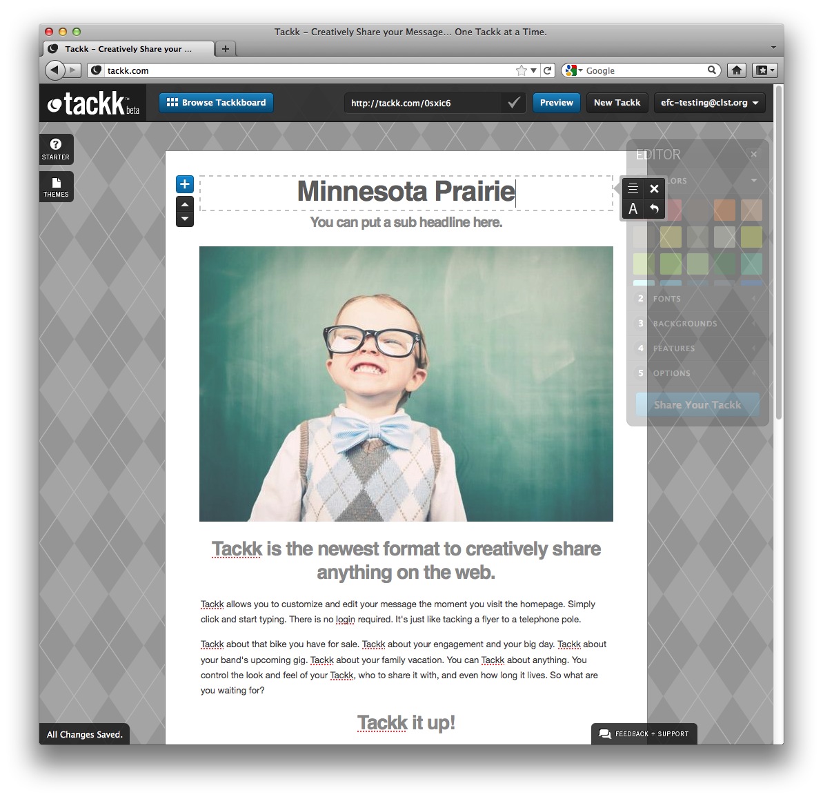 Editing text is direct, not at all modal. Click on the text to be edited and type away. While entering new text some style icons appear to facilitate certain changes (justificaiton, size, undo, and so on).
Some tasks are more modal, such as uploading a photograph which requires not only a selection of the photo, but a confirmation of the process with a click on an “Upload Now” button.
The background can only be chosen from a limited set of textures, there is no way to use one’s own photo as a background, for example.
Even though the “editor” floating window (and it really does float, I can move it!) seems like something that could change the attributes of any element, it becomes apparent that it only effects global settings for the whole tackk. For example, the “colors” can’t be used to change the color of an individual headline, but only all the headlines and the background. This is more similar to what Marquee calls the “accent color,” though less explicit about that role.
Each setting in the “editor” window also has a prominent number (“colors” is “1” for example). These numbers don’t seem to serve any function (they are not keyboard shortcuts, for example) and they imply a staging or order that is not, in fact, required.
When the editor window is dismissed (using it’s “X”) it retreats to a tab on the left side of the window. This tab, which expands to a floating window, behaves differently from the tabs on the right (which only expand in place, as though pulling their content from the right edge of the window) and the bottom (which brings up a modal window, or, in the case of the “All Changes Saved” tab, does nothing). This variety of behavior is a bit jarring.
Sharing
All tackks have a sharing block appended to them with the usual Facebook, Twitter, Google+, and Pintrest buttons.
Sharing is also facilitated by the short URLs provided for every tackk and easily copied to any service. This short URL is editable, so that “http://tackk.com/0sxic6” can be turned into “http://tackk.com/prairie” and more easily shared.
When a tackk is published with the “Share Your Tackk” button, users are offered a chance to copy this short URL or immediately share it with Facebook, Twitter, Google+, LinkedIn, Pintrest, Craigslist, Tumblr, or email.
 Finally, users have the option (on by default) of placing their tackk on the Tackkboard, a catalog of all tackks made available with the “Browse Tackkboard” button.
Community
The floating “editor” window includes a “features” section which allows the user to choose whether or not contact or comments blocks appear in the tackk.
Comments on tackks are facilitated via Facebook.
Publishing
Each Tackk gets a short URL that is defined from the start of editing, for example: http://tackk.com/pu7v3i. However, the user can edit that URL in the Tackk bar at the top of the screen to create a vanity URL such as: http://tackk.com/bbob. The vanity URL will then replace the short URL in any presentation of the tackk, however, the short URL will continue to resolve to the tackk as well.
Tackks are, by default, published to a Tackkboard, though users can opt out of this publication.
The Tackkboard can be viewed by clicking on a “Browse Tackkboard” option from any published tackk. It presents a seemingly unordered set of “featured tackks” in a matrix.
Privacy
The only privacy afforded a tackk is opting out of the Tackkboard.
Mobile
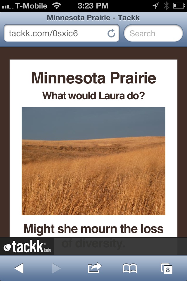 Tackks are responsive and render well on a variety of devices.
Editing is not available on the iPhone.
Editing works very well on the iPad. The modeless editing is just as successful as on a desktop.
Comments
You are welcome to edit this page if you have the password. You can also choose to just leave a comment below, if you like.
Robert Hatta / 10 October 2012 / 11:10
Eric, a few changes have occurred since this review that would benefit from your thoughts: - Tackk It button changed to “Share your Tackk” - HTML email sharing
efc / 10 October 2012 / 14:46
Updated that reference to the button.
