Describing themselves
 Smore presents a landing page for folks without an account that called itself “beta” and calls their editor a “page builder.” This landing page includes a video promoting Smore, shares testimonials “Smore is the best page builder I’ve ever seen!” (anonymously), and presents key features, “Human readable analytics you can use,” and “Promote and share your page like a pro.”
Interestingly, Smore still has the remnant of a pitch that was much more aggressive in August, with a green top bar that states “New: Smore for Apps — Beautiful splash pages for your App Store apps.” This notion of serving app developers in their promotion of mobile apps is probably what drives some of the analytics and sharing feature set.
Smore has also been moving toward the word “flyer” to represent their pages, probably for reasons similar to Tackk’s use of “tackk” and CheckThis’ use of “poster,” to differentiate from a typical we page. Some remnants of pre-flyer days can still be found, such as the use of the slogan “beautiful pages instantly” in the top Smore bar and the HTML title of the homepage.
Note that after you have logged in you find a much more subdued and down-to-business home page greeting you. All the sales pitches are gone except for a headline “Use Smore flyers to get the word out.”
Signing up
 For folks landing without an account the home page is a lengthy, though pleasant, sales pitch including a video and some key features. A slideshow presents a few representative flyers from Smore, and next to the “Currently in beta” warning is a soft red “Try it now” button.
Clicking the “Try it now” button exposes the fact that you can sign up for a Smore account by linking your Facebook account or signing up for a direct account. The Facebook link warns that “This app may post on your behalf, including new flyers you designed, flyers you viewed and more.” Without Facebook you are just required to share your name, email, and create a password.
Once you are logged in you are directed to a new homepage, and this is the one you will see whenever you visit Smore until you log out. This homepage does away with the heavy pitch, including just a brief “Use Smore to get the word out,” and a big orange “Start a new flyer” button. Below this invitation is a matrix of “Featured Flyers” from other users that can serve as examples of what can be done with Smore.
Email contact
A welcome message is sent, inviting the user to start using Smore. No confirmation of each flyer created is sent, no encouragement to share flyers. Interestingly, given the rise of the term “flyer” at Smore, the emails comes from smorepages.com instead of smore.com.
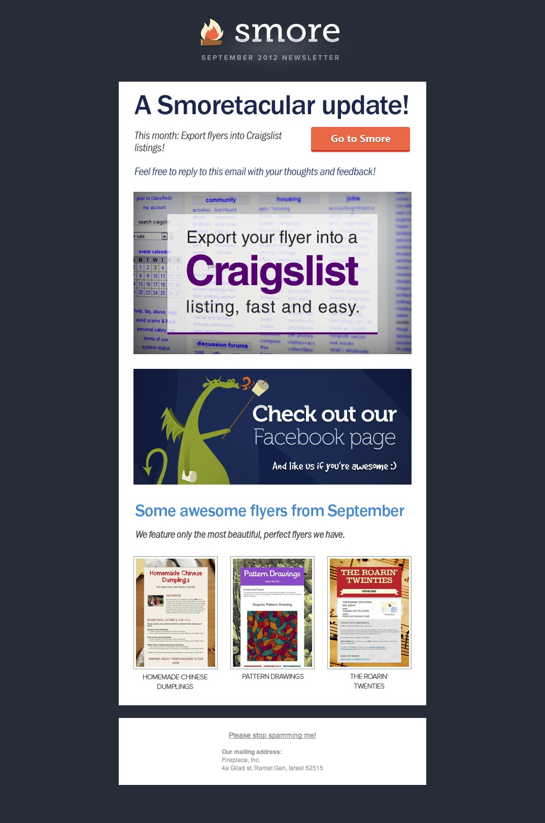 In September I received the first of what appears to be a monthly newsletter email. This promoted a new feature (Craigslist integration) and a few example flyers.
Functionality & features
 Smore is using a guided process to page-building. Clicking on the “Start a new flyer” button on the homepage presents a menu of choices in a modal dialog box. You have to decide the mission of your flyer: event invitation, product, personal, business, informational, app, or other. You can also click a “Start from blank” button. Clicking one of the choices takes you to a template for that kind of page. Since the template can be rearranged, in a way it does not matter which type of flyer you choose up front, but the templates are pretty heavy, with lots going on, so it is easy to get overwhelmed if you make the wrong pick at the top. If you choose “other” then Smore asks you to describe what you are making before you start from a blank page. Presumably this helps them discover what other templates might be helpful to produce, but it also presents one more hurdle to getting started.
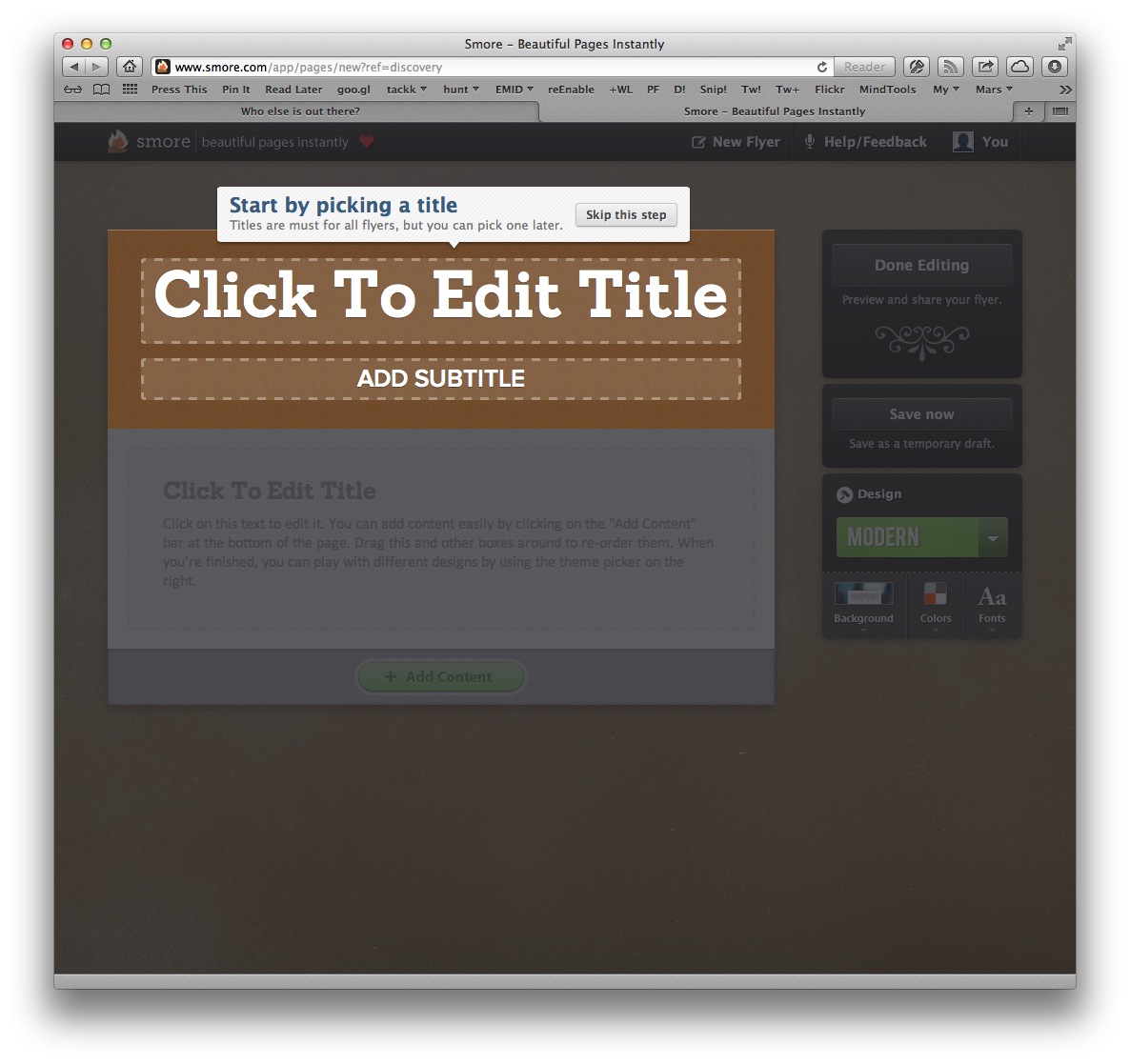 The guidance continues even once the template is presented, walking you to the first element on the page and suggesting you click on it to edit. After that click, you are left on your own.
Editing itself is very modal. Instead of editing text in place, a modal dialog is presented with fields for each item to be edited (title & subtitle or title & text or URL) and a button to submit the data. There is an “Add Content” button at the bottom to let you add new modules (text, title, embed link, video, audio, picture, event, gallery, and bio). The embed link in particular seems misnamed since it only takes a URL and presents it as an address rather trying to retrieve and embed its contents.
Your flyer is saved as you go, though a placebo “Save now” button is also presented. This creates some confusion since there is also an “Update” button in the editor.
Editing
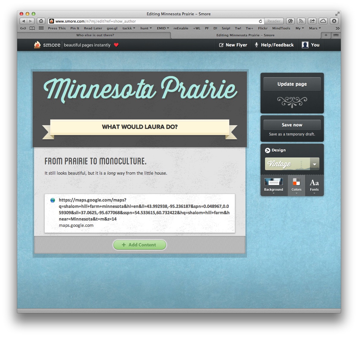 There is very little control of the look and feel of Smore flyers. You can choose from four designs: handwritten, minimal, modern, or vintage. Each of these will then offer a very limited set of choices for background, color, and font.
For example the vintage design offers a choice of 16 background images, 11 color palettes, and 4 fonts.
Sharing
Once a flyer is published or updated some sharing options are presented: email, Facebook, Twitter, linking, or embedding. Flyers can also be exported to Craigslist to enhance advertising there.
Ubiquitous Facebook share and Tweet buttons as well as an odd “Link” short version of the URL without the title portion are all placed above the flyer, in what feels to me like a very distracting position.
Community
The comments feature added to the bottom of flyers when they are published seems to be exclusively a tie-in of Facebook posts using the Facebook social plugin.
Publishing
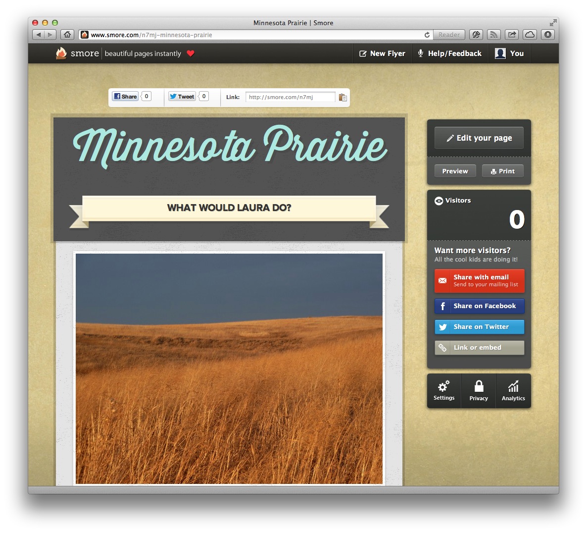 Although in the settings an option is given to provide a host name for the page (which then requires setting DNS name servers properly), there is no option to create a vanity URL at smore.com. The URL created is a combination of semantic-free id and semantic-ladden title of your flyer, as in:
http://www.smore.com/n7mj-minnesota-prairie. The title portion can be left off for a shorter URL: http://www.smore.com/n7mj.
Surprisingly, after the heavy front-page pitch for analytics, the only analytics offer actually made for flyers is that Smore allows you to type in your Google Analytics code so that your flyer will be tracked by your own Google analytics account.
Privacy
Privacy settings for a flyer can be unlisted, public, or “super” which is described as “optimized to get as many visitors as possible.” This last option presents the reader of your flyer with a more intrusive request to share your flyer via Facebook and Twitter (with more features to come).
Mobile
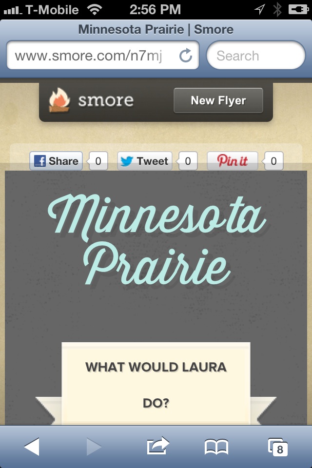 While Smore does make its flyers somewhat responsive to being viewed on mobile devices, their choices are a bit odd. As the device size shrinks, the Smore branding and social attributes of the content get more and more prominent while the flyer’s content get progressively marginalized.
Editing the flyers on a phone is an exercise in frustration. None of the editing screens and modes are responsive, so the pages are tiny, the modal dialogs nearly impossible to read, and if you zoom in to parse the requests being made, the “done” buttons end up out of reach. Clearly, editing was not intended to work on mobile devices.
Comments
You are welcome to edit this page if you have the password. You can also choose to just leave a comment below, if you like.
Robert Hatta / 10 October 2012 / 10:34
Eric, have you started to receive promotional emails since your original sign-up? I’ve received 1 announcing a Craigslist export feature.
efc / 10 October 2012 / 14:37
Yes, a monthly newsletter, it appears. I added a reference above.
Koplak / 06 December 2012 / 12:01
That was a fun tour. Question for William Patrick Wend…I followed the link to your copy of the flyer and it metieonnd that you interviewed the singer back in 2000. Just curious which “singer” you interviewed, hopefully Eric.As for the Pipeline show and the Something Must Be Done cover…I remember some people noticing at the show, but Korri only knew the chorus of the song, the rest he just yelled. We we’re like, “why didn’t you just let one of us sing it if you didn’t know the song?“Funny that 2 things were just metieonnd here…how much was stolen from that tour and the thing about graffiti lettering. Anyone with the book Spraycan Art can find the letters that were ripped off to “create” that logo. And as for the other “stealing,” karma has definitely been a bitch. I’d love to know who wrote that anonymous comment, either someone close to the situation(s) or just someone who has heard the truth.
gjpwhrqnmpk / 07 December 2012 / 22:30
gLmyEA drctttqdxfkm
